Accessible data tables that survive real data
By Adrian Vasquez · · 10 min read
Sticky headers, keyboard selection and 12,000 rows: the patterns that held up in production, and the ones that did not.
Start from real, ugly data
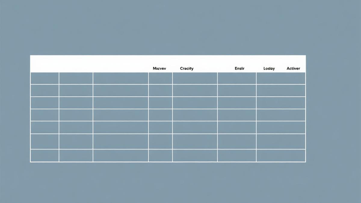
Demo tables have five tidy rows. Production tables have 12,000 rows, null amounts, 60-character merchant names and three currencies. Design against the ugly set or you will ship a layout that breaks on day one.
Semantics come first: a real table element with proper scope on headers, a caption describing the dataset, and column headers that make sense read alone by a screen reader.
Keyboard first, virtualisation second
Operators live on the keyboard. Arrow keys move the focused cell, Space toggles selection, Shift+Arrow extends a range, and focus is never lost when a row updates underneath. Selection state is announced through a polite live region so bulk actions are auditable.
Virtualisation is what makes that survivable at scale, but it fights accessibility: rows that do not exist cannot be announced. We keep the full row count in aria-rowcount and set aria-rowindex on rendered rows so assistive tech reports position honestly.
What we removed
Drag-to-reorder columns died in usability testing — impossible to operate by keyboard and rarely wanted. Horizontal scrolling with frozen columns beat responsive card layouts for comparison work, and on small screens we ship a genuinely different view rather than a squeezed grid.
The remaining pattern has held for two years across three products, with no accessibility regressions reported since contrast and focus tests entered CI.